



Neutral colour palettes are increasingly popular across interior design, fashion, and branding due to their versatility and timeless appeal. They provide a calming, adaptable background that allows other colours and textures to stand out without overwhelming a space or style.
This growing attraction is partly driven by a desire for simplicity and balance in environments that can otherwise feel busy or chaotic. Neutrals foster a sophisticated, understated aesthetic that suits a wide range of tastes and settings.
People also appreciate how neutral tones create a sense of cohesion and continuity, making it easier to update or personalise designs over time without clashing. This practicality adds to their enduring appeal in contemporary trends.
Understanding Neutral Colour Palettes
Neutral colour palettes are defined by subtle, low-intensity hues that create understated and adaptable designs. These palettes rely on variations of whites, beiges, greys, and other muted tones to establish calm and balanced environments. The following clarifies key elements that distinguish neutral colours from other shades.
What Defines a Neutral Colour
Neutral colours lack strong chromatic presence, meaning they do not lean heavily toward any primary or secondary colours. They are often described as muted, subdued, or desaturated. This absence of vivid colour allows them to harmonise easily with more saturated shades or stand alone in minimalist settings.
Neutral colours commonly evoke natural materials and light, such as stone, sand, or cotton. Their subtle tonal values support visual comfort and versatility without creating stark contrasts. Whites, creams, taupes, and greys are typical examples because they provide a soft, unobtrusive base.
Types of Neutral Palettes
Neutral palettes vary widely depending on the balance between warm and cool tones. Warm neutrals include beige, cream, and some taupes, which often have yellow, red, or brown undertones. These create cosy, inviting atmospheres.
On the other hand, cool neutrals encompass many greys and certain whites with blue or green undertones. These can make spaces feel crisp, clean, and modern. Combining both warm and cool neutrals in a palette adds complexity while maintaining subtlety.
Designers often mix neutrals across this spectrum to achieve specific moods, from soft and restful to sleek and sophisticated. This adaptability is a hallmark of neutral palettes.
Common Neutral Tones and Their Undertones
Beige is a warm neutral with undertones ranging from yellow to pink, offering a gentle, earthy base. Taupe blends brown and grey, often appearing warmer or cooler depending on light and context.
Grey neutrals can have blue, green, or brown undertones, influencing how they interact with other colours. Warmer greys feel natural and understated, while cooler greys lend a more industrial or contemporary edge.
Whites vary from stark, cool whites with blue undertones to creamy whites with hints of yellow or peach. This range shapes the ambience significantly, especially in natural or artificial lighting.
| Neutral Tone | Typical Undertones | Effect |
| Beige | Yellow, pink | Warm, earthy, calming |
| Taupe | Brown, grey, sometimes purple | Versatile, sophisticated |
| Gray | Blue, green, brown | Cool or warm, modern or organic |
| White | Blue, yellow, peach | Clean, bright, soft |
Selecting undertones deliberately enhances the harmony and balance of a neutral colour palette.
The Enduring Appeal and Psychological Impact of Neutrals
Neutral colour palettes balance elegance and comfort, often creating spaces that feel both sophisticated and approachable. These hues influence mood, provide versatility in design, and maintain relevance across changing trends.
Timeless Elegance in Design
Neutral hues such as beige, taupe, and grey have long been associated with timeless elegance. They offer a subtle backdrop that allows other elements like texture, form, and contrast to stand out without overwhelming the space. Designers use earth tones and soft whites to create environments that avoid visual clutter.
This restrained colour approach ensures that interiors remain stylish over the years, resisting the need for frequent updates. The neutrality also creates a cohesive flow between rooms and complements a wide range of furnishings and decorative items. Warmth in neutrals prevents spaces from feeling sterile, maintaining a refined yet inviting atmosphere.
Calming and Versatile Atmosphere
Neutral palettes inherently produce a calming atmosphere through their minimal visual interruption. Shades inspired by nature, such as soft greys and muted browns, reduce stress and encourage relaxation. Their understated tones help in creating spaces conducive to focus or rest.
Versatility is another key strength. Neutrals adapt well to different lighting conditions and architectural styles, whether modern or traditional. They allow easy layering of deeper hues or accent colours without clashing, providing practical options for both bold and subtle design choices.
Influence on Mood and Perception
The psychological effects of neutral colours are significant in shaping how a space is experienced. They often evoke feelings of stability and comfort, which can improve occupants’ emotional well-being. Unlike brighter colours that may stimulate or energise, neutrals promote mental clarity and reduce distraction.
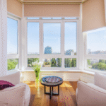
Neutral colour schemes can also influence perception of space. They tend to make areas feel larger and more open, especially when paired with natural light. However, poor use of contrast within a neutral palette can lead to flatness, so careful balance between light and dark tones is essential to maintain visual interest.
Neutral Palettes Across Design Styles
Neutral colour palettes adapt well across diverse design styles, providing balance and cohesion. They accentuate natural light and highlight textures, offering flexibility in both decor and furniture choices.
Modern and Contemporary Applications
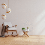
In modern and contemporary design, neutral palettes often consist of shades like soft greys, warm beiges, and muted whites. These colours create clean, uncluttered spaces that emphasise architectural lines and open floor plans.
Neutral furniture with sleek silhouettes pairs well, allowing accents such as metal or glass to stand out. The restrained colour scheme also enhances natural light, making interiors feel spacious. Accessories are kept minimal, focusing on form and function rather than colour.
Traditional and Classic Interiors
Traditional design utilises neutral colours to complement rich textures and intricate patterns without overwhelming the senses. Earthy tones like taupe, ivory, and warm greys create a timeless backdrop for ornate furniture and detailed woodwork.
Neutral shades help balance heavy fabrics such as velvet and brocade, providing a subtle contrast. These palettes unify classic elements and allow for layered decoration with rugs, draperies, and artwork, maintaining warmth and elegance.
Scandinavian and Minimalist Inspirations
Scandinavian and minimalist interiors rely heavily on neutral tones to evoke simplicity and calmness. Whites, light greys, and soft browns set a serene stage that highlights natural materials like wood and wool.
This restrained palette maximises natural light, a key feature in Scandinavian design, while promoting uncluttered spaces. Neutral furniture with clean lines enhances the feeling of openness, supporting the minimalist ethos of ‘less is more’.
Eclectic and Bohemian Incorporations
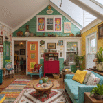
Neutral palettes in eclectic and bohemian styles serve to ground diverse patterns, colours, and textures. Shades such as sandy beige, warm grey, and muted olive act as a canvas that unifies vibrant textiles and layered decor pieces.
In these interiors, neutral tones balance bold artistic expression and tactile materials. They create harmony amid variety, enabling natural light to soften and integrate diverse elements without visual chaos.
Practical Strategies for Using Neutral Colour Schemes
Using neutral colours effectively requires deliberate choices in texture, material, and accent colours. Achieving depth and interest in a neutral colour scheme depends on balancing these elements carefully to avoid flatness or monotony.
Pairing Neutrals with Textures and Materials
Incorporating varied textures like wool, velvet, and linen can add dimension to a neutral palette. For example, linen curtains paired with a wool throw pillow create tactile contrast without introducing bold colours. Natural materials such as cotton and terracotta further enrich a neutral setting with understated warmth.
Mixing smooth and rough textures enhances visual intrigue. A soft velvet cushion against a cotton sofa provides subtle depth, preventing the room from feeling sterile. Layering textures is essential to maintain comfort and visual appeal within neutral schemes.
Balancing Neutrals with Accent Colours
Introducing bold accents or soft pastels breaks up the neutrality and draws attention to key design elements. Accent colours can be added through accessories like artwork, rugs, or cushions in terracotta or muted blues.
It is important that accent colours complement, not overwhelm, the base neutral tones. Placement of accents should be strategic, such as a single vibrant throw pillow or a pastel vase, to maintain harmony while injecting personality.
Avoiding a Bland or Monotonous Look
Neutral schemes risk feeling dull without careful planning. To combat this, layering different shades of beige, grey, and white creates subtle variation.
Using furniture and decor with diverse shapes and finishes also prevents monotony. For instance, combining matte and glossy surfaces or incorporating natural wood with painted elements adds interest. A neutral colour scheme thrives on these contrasts rather than solely relying on colour difference.